Reality Lab
Branding | Visual Identity
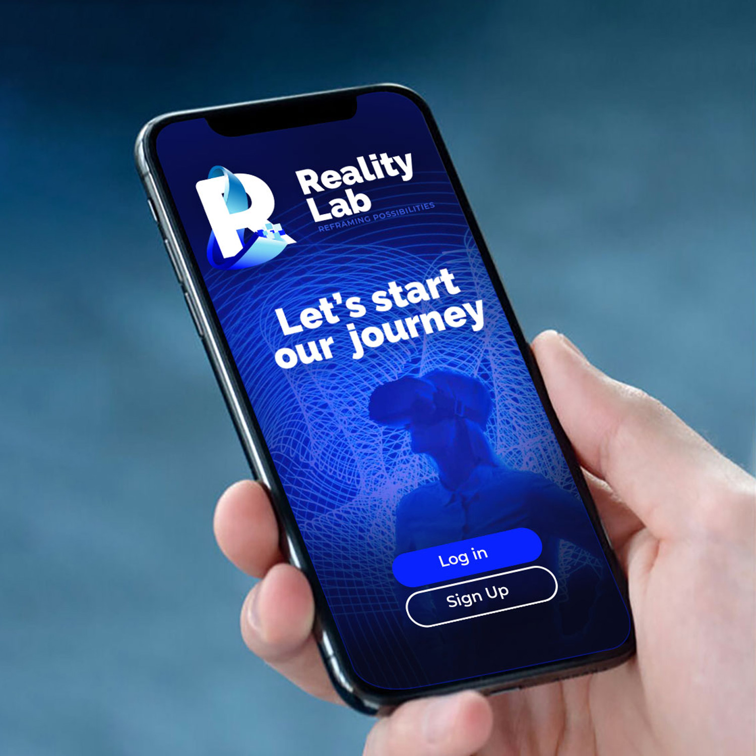
This project emerged from an AutoSueco Design Challenge, swiftly creating an identity for a new augmented reality research department.
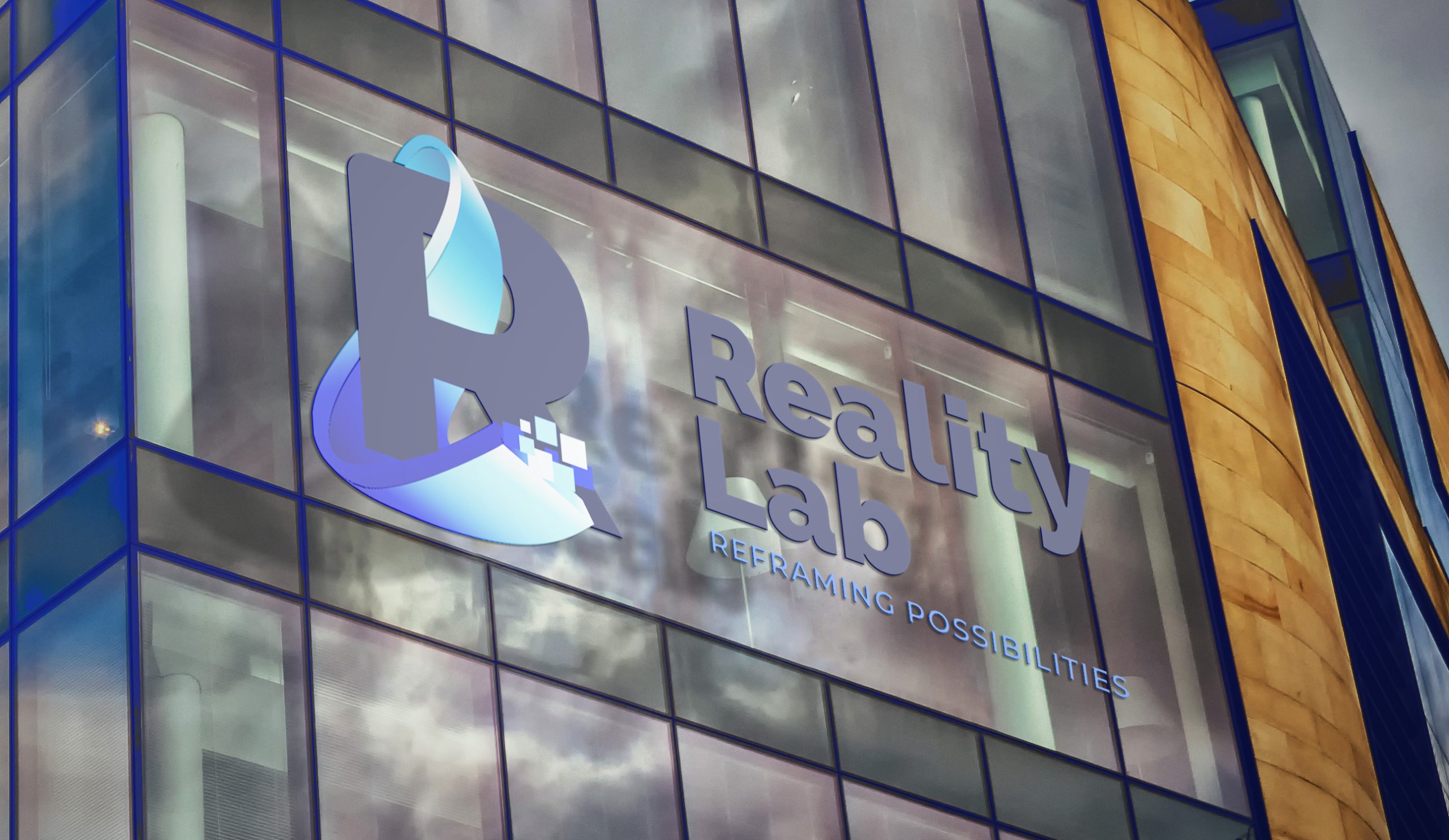
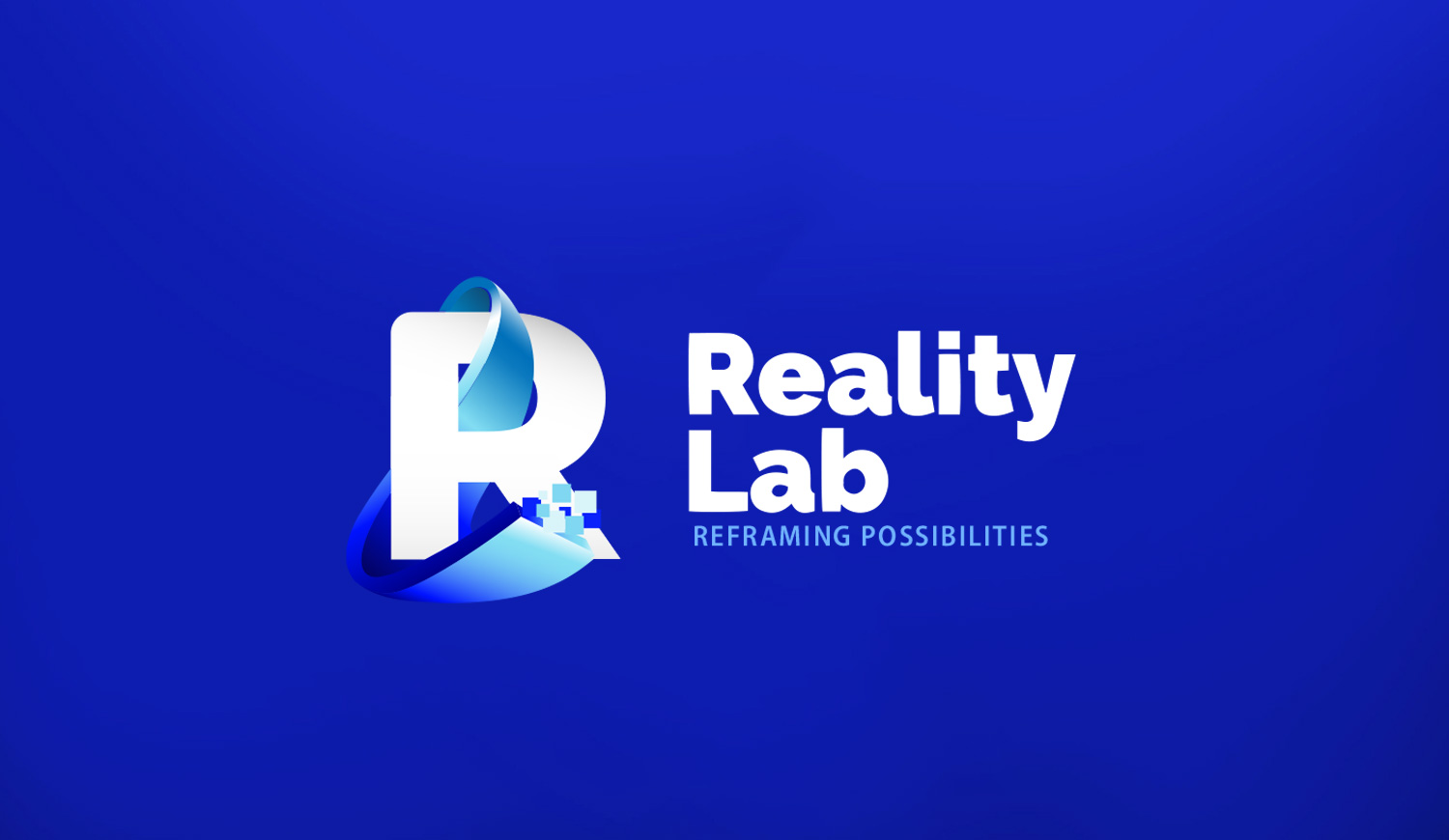
The creative concept combines “Reality” and “Lab,” infusing personality into the initials to convey symbolism in the logo design. Pixelation at the end of the “L” alludes to the virtual world, where everything can be pixelated.
Considering the history of the Nors group and its deep roots in Auto Sueco and Volvo, it was crucial to infuse that DNA into this logo.
In essence, the logo represents the convergence of reality and the laboratory, capturing AutoSueco’s venture into augmented reality R&D.
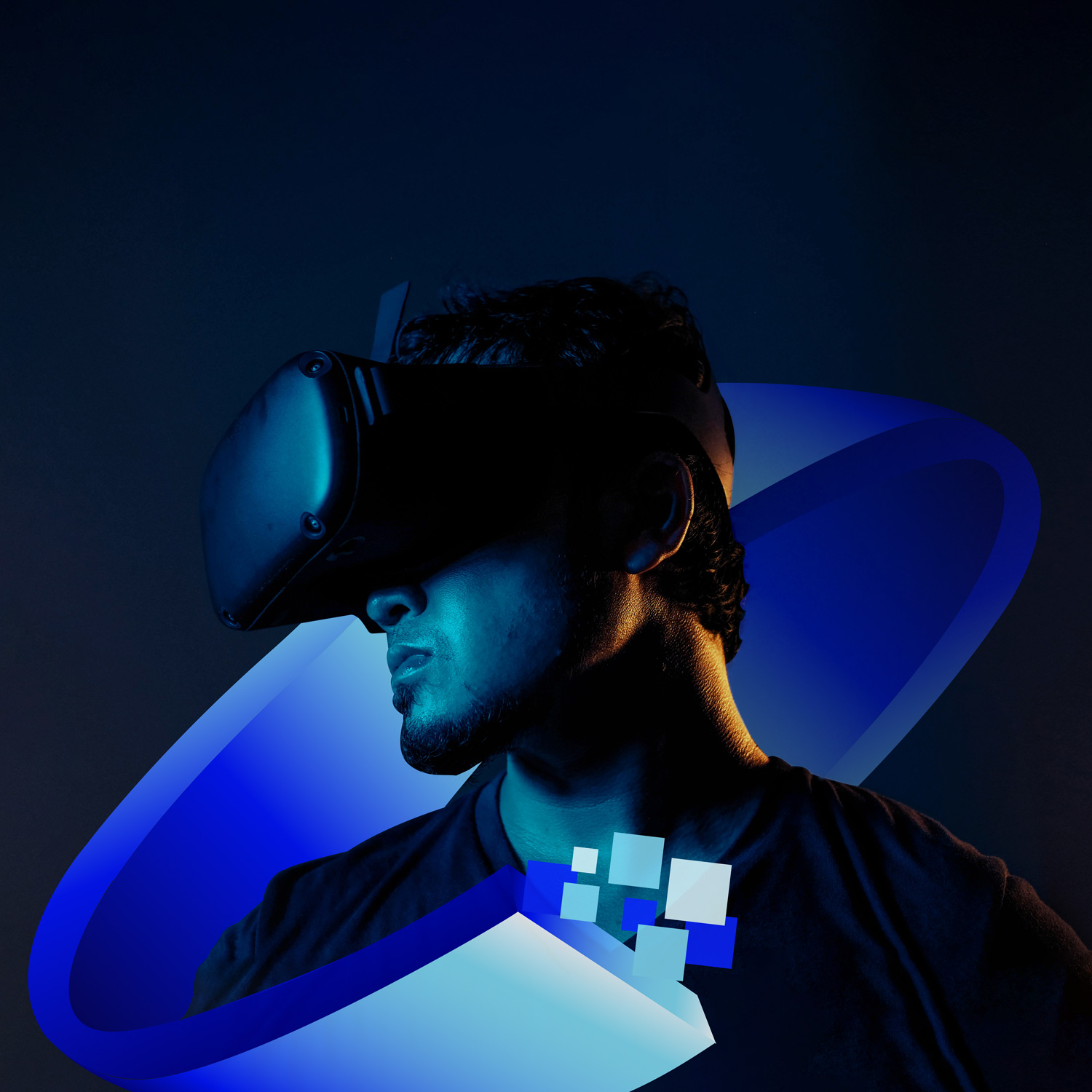
Deliberate pixelation signifies the virtual realm, embodying the transformative potential of every pixel, reflecting the new department’s innovative spirit.
AutoSueco group
By incorporating elements from the Nors group’s historical lineage and the Auto Sueco-Volvo legacy, the logo establishes a meaningful connection to the group’s rich heritage. This strategic integration pays homage to the foundation on which the AutoSueco group is built, creating a sense of continuity and tradition within the context of cutting-edge technological advancements.
In conclusion, this project not only meets the immediate challenge of crafting an identity for the augmented reality department but also weaves a narrative that blends the contemporary aspirations of the AutoSueco group with the timeless echoes of its historical roots. The result is a logo symbolizing the convergence of reality and virtual exploration, honoring the enduring legacy of the Auto Sueco and Volvo group.
