Oporto Buggy
Branding | Visual Identity
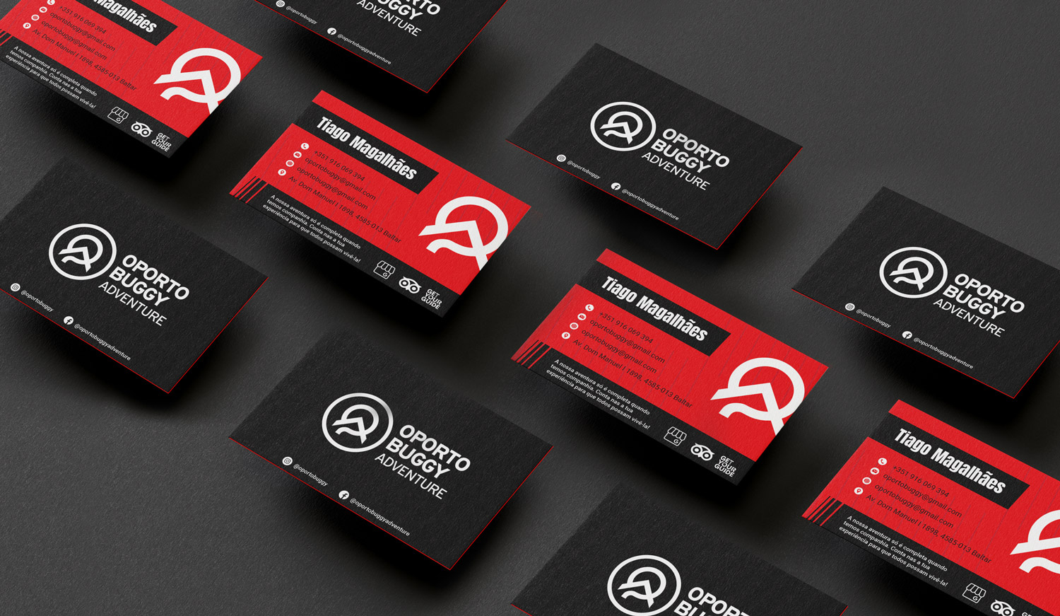
The focal point of Oporto Buggy’s visual identity is the combination of the letters P and O, creating a logo that transforms into a mountain representative of the challenging landscape where the brand’s adventures unfold. This symbolic fusion of letters and nature alludes to the profound connection between extreme sports and the natural environment.
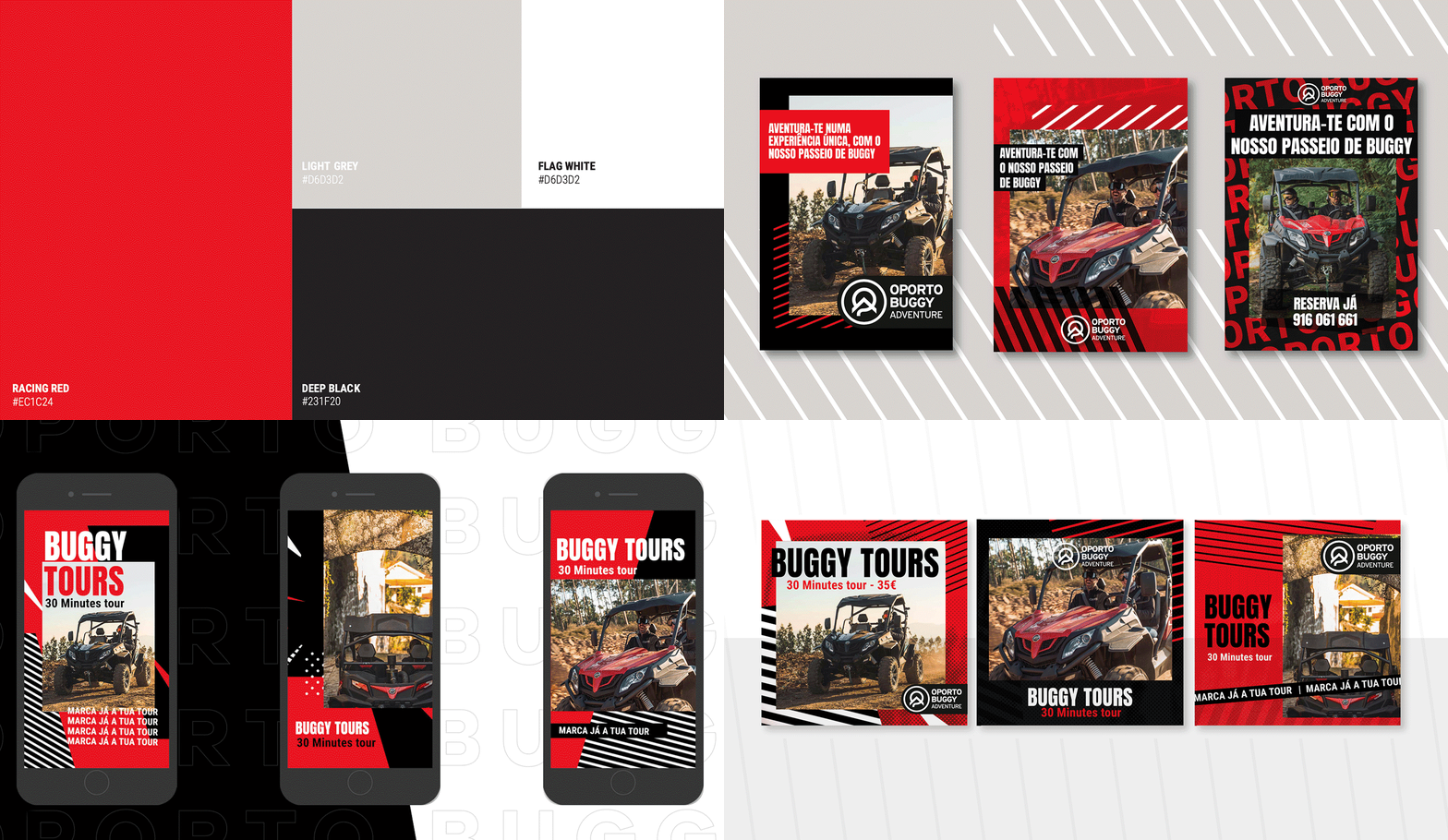
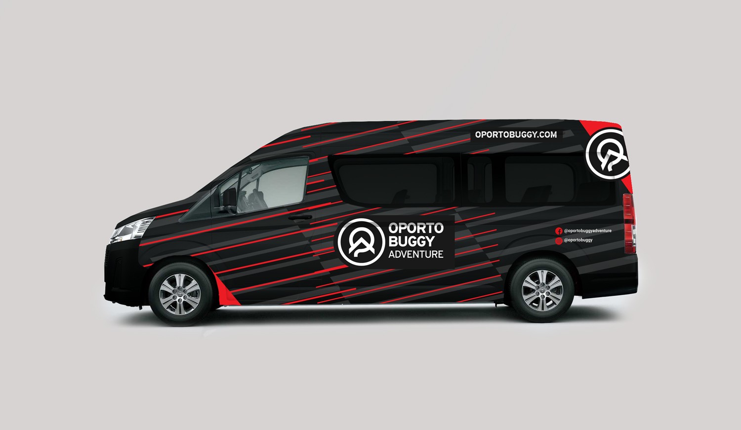
Colors play a pivotal role in Oporto Buggy’s visual identity. The strategic choice of red, white, and black aims to convey the unique essence of extreme sports. The intensely vibrant red evokes the passion, energy, and intrinsic excitement of these activities, while white suggests purity and adrenaline. Black adds a touch of sophistication and mystery, accentuating the intensity of the experiences provided by Oporto Buggy.
This meticulous design is not merely aesthetic; it is a visual narrative translating the thrilling and challenging experience offered by the brand. Every curve and shadow in the logo reflects the rugged terrain of the explored trails, creating an identity that goes beyond the visual, immersing viewers in the unique atmosphere of extreme sports practiced in Oporto’s stunning landscapes.
In this collaboration with IN.TO Digital Marketing Agency, Oporto Buggy has not only solidified its visual presence but also established a visual language that communicates the essence of its activities in a vibrant and engaging manner.
Credits: IN.TO Digital Marketing Agency


