IKONISH
Branding | Visual Identity
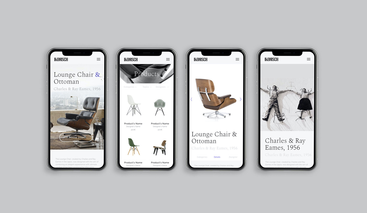
Ikonish is a visual identity that encapsulates the concept of reconditioning furniture with ironic undertones from a particular niche. A strategic journey commenced from the naming phase, where we amalgamated the concepts of a niche and the idea of iconic furniture into a single word that would embody the spirit of the brand.
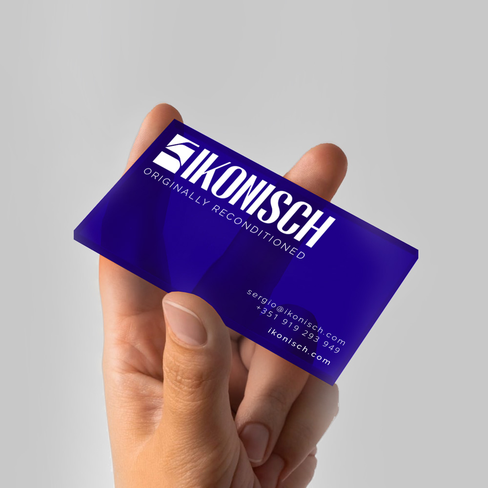
The logo font underwent a redesign, drawing inspiration from an iconic font, aiming to represent something unique that echoes the product design ethos of the 1970s and 80s. The goal was to maintain a look that is not only current but also resonates in today’s market.
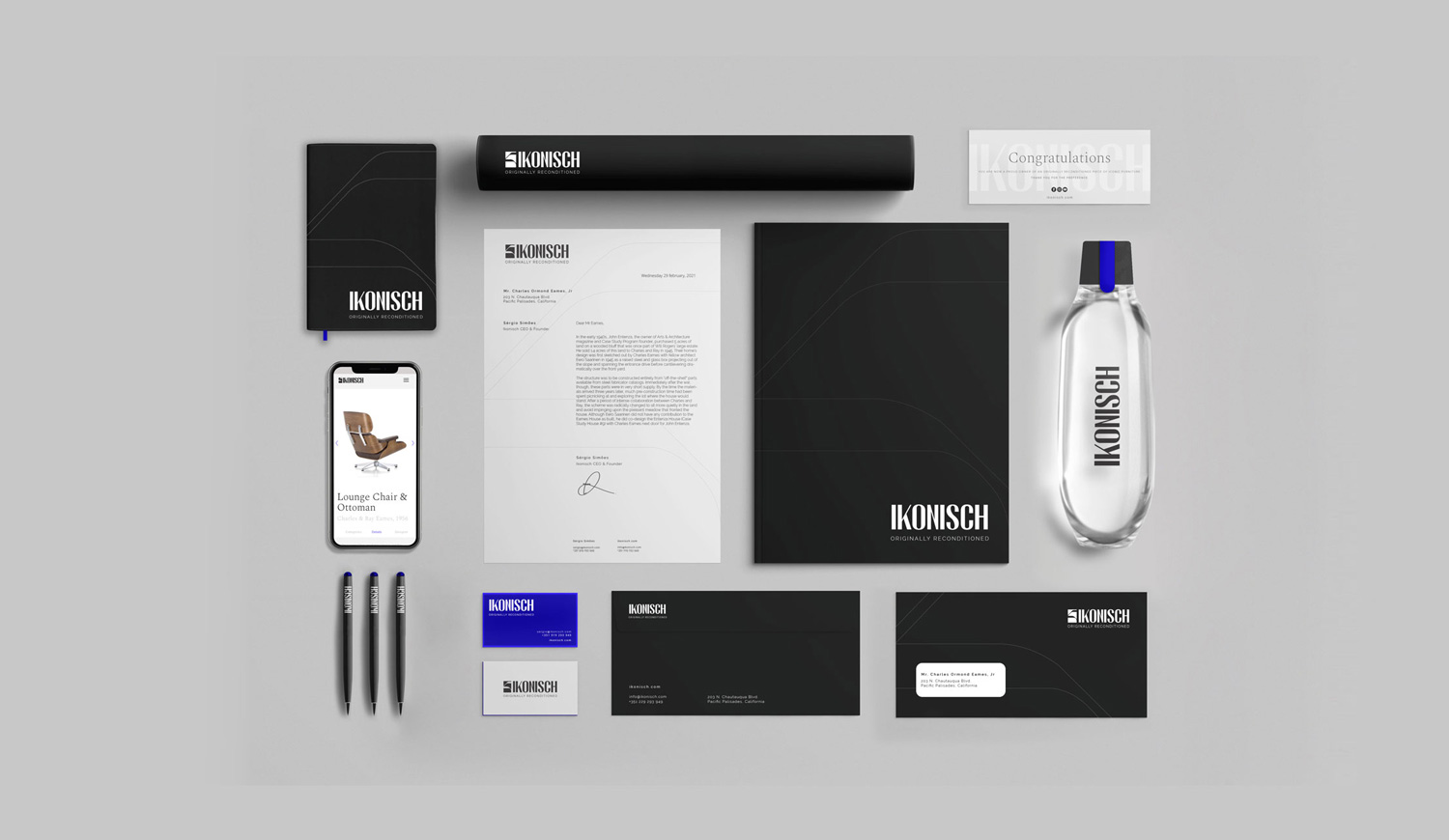
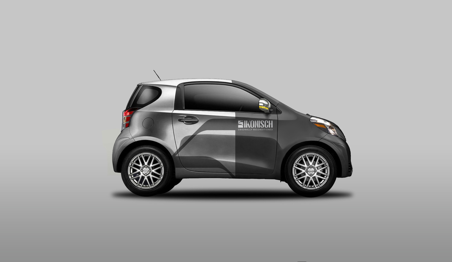
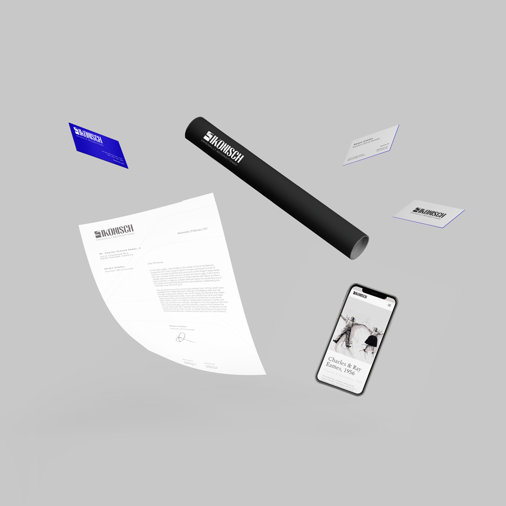
In crafting the visual identity for Ikonish, every element was carefully curated to convey a sense of irony and sophistication. The choice of color palette, typography, and logo design all harmonize to create a brand identity that stands out in its niche market. The subtle irony embedded in the brand name is mirrored in the sleek yet retro-inspired design elements, effectively bridging the past and the present.
This meticulous approach not only solidifies Ikonish’s visual presence but also communicates a narrative of transforming furniture with a touch of wit and style. Collaborating with IN.TO Digital Marketing Agency allowed Ikonish not just to create a brand identity but to establish a visual language that resonates with its target audience and captures the essence of its unique approach to furniture reconditioning.
Credits: IN.TO Digital Marketing Agency


