Gleven
Branding | Visual Identity
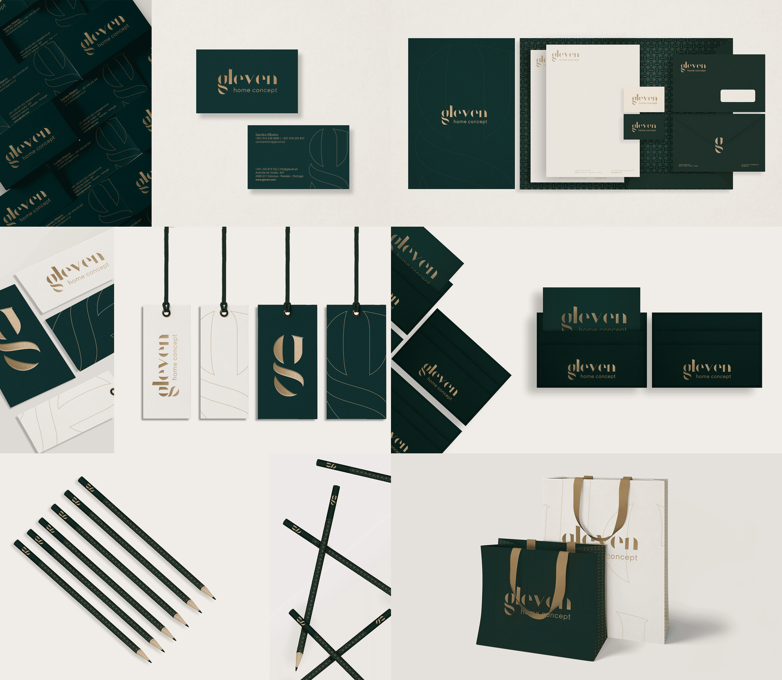
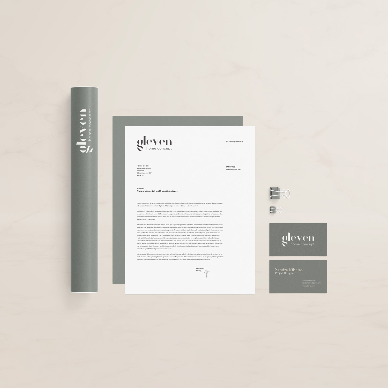
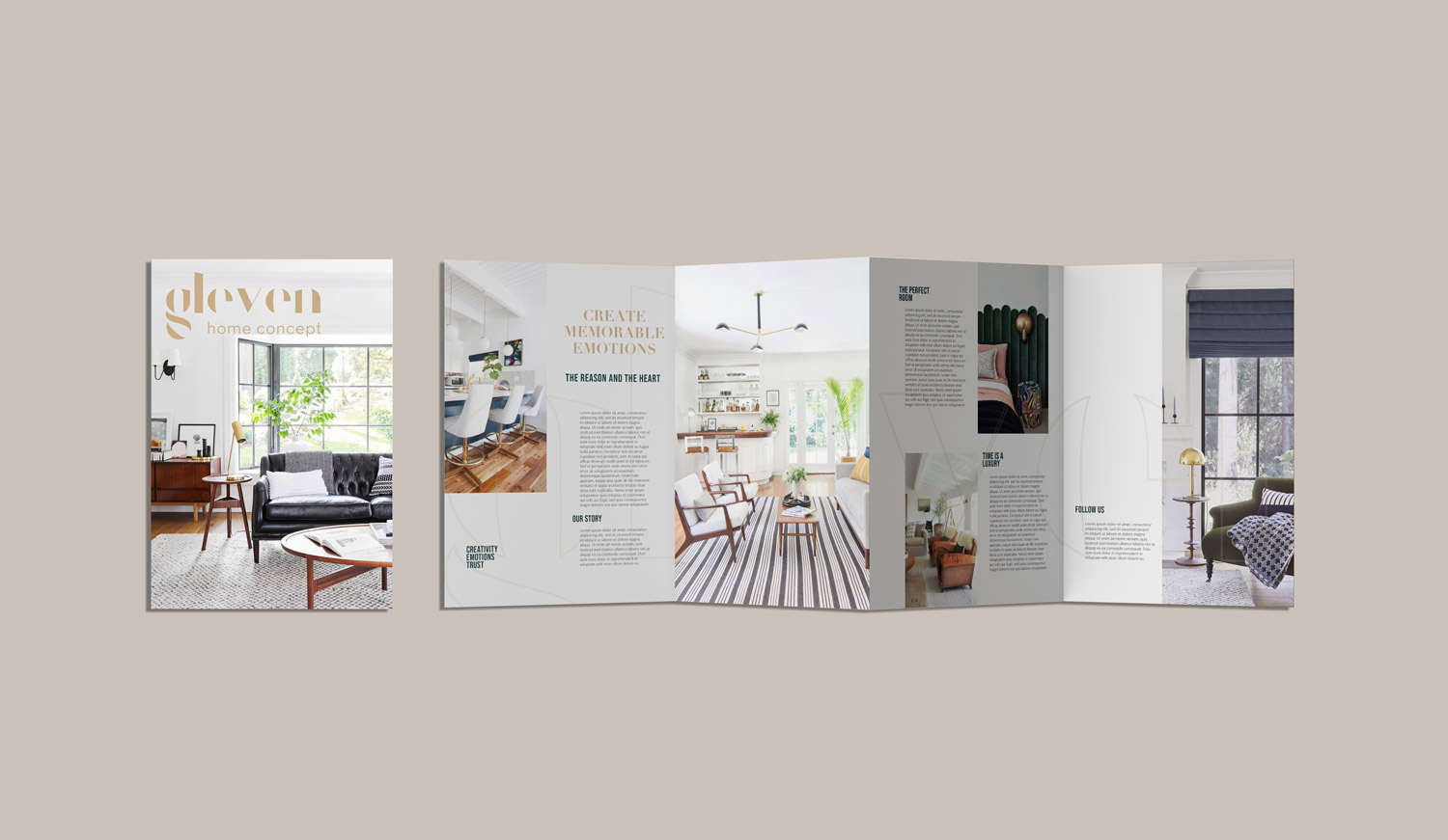
Gleven, an interior design brand, aimed to establish itself as a reference in the Home Concept realm. In crafting the representation of the brand’s essence, we opted for a unique approach: a custom-designed font tailored to this purpose, rooted in the values and rich history of the company. Elevating the initial letter to a central role, it transcends its alphabetic function, evolving into a simplified logo. This simplification is achieved through a harmonious interplay of form and background, where the letter is complemented by a gaze.
Each contour of the initial letter is not merely aesthetically pleasing but carries a significant narrative. They represent the four fundamental parts that compose the company’s administration, fostering a genuine emotional connection with the people behind the brand. This emotional bond is crucial, extending beyond visual aesthetics, enabling clients and partners to forge a deeper connection with Gleven.
The development of this visual identity was meticulously undertaken, considering not only the aesthetic aspect but also the narrative it conveys. By adopting this personalized approach, Gleven not only stands out in the interior design industry but vividly communicates its history, values, and the team driving the brand’s excellence.
Ultimately, each curve, every detail of this custom-designed font is a visual expression of Gleven’s dedication to transforming spaces and telling stories through interior design. This commitment not only elevates the brand but also establishes a lasting connection with those seeking not just interior design but a unique sensory and emotional experience.
Credits: IN.TO Digital Marketing Agency
Credits: IN.TO Digital Marketing Agency


